Joel Meyerowitz - The street
Is an award-winning photographer whose work has appeared in over 350 exhibitions in museums and galleries around the world. He was born in New York in 1938. He started to began photography in 1962 and he is a ''street photographer'' in the traditional of Henri Cartier-Bresson and Robert Frank but however, he now exclusively works with colour.
Robert Frank - The street
Was born in Switzerland in 1924, Frank grew up of the son of a wealthy Jewish family with a Swiss mother and a German father. Frank began his career in the mid-1940s before emigrating to America in 1947. Frank is not just a photographer but also a filmmaker (independent, unconventional and personal in both media). Frank is best known for his book, ''The Americans'', this book is the most 'influential' book of photographs of the past fifty years with nine separate edition. On the other hand though, Frank has played the 'outsider' throughout his career.
Adam Murray - Public Transport Locations
I do like the work of this photograph and I think the main reason of why I do is purely because of the black and white effect as I think it gives of an 'abandoned' feel with all the emptiness.
The words that I would associate with this picture would be 'gloomy' this is because of how it's lit.
I think they photographed in this location because they was on there way to somewhere but decided to capture some photos on the way which he found interesting.
A practical considerations that I would of thought the photographer would have to do when shooting this specific photo is to change the settings to 'monochrome' to get the black and white effect.
I don't like the work of this photograph and the reason why I don't is because I don't find that specifically stands out as I think it's 'unimaginative' with how boring and dull it looks.
The words that I would associate with this picture would be 'cold' and 'deserted'. This is because by the looks of the photograph there is no one around whatsoever which makes it 'cold' and 'lonely'.
I think they photographed in this location because
A practical considerations that I would of thought the photographer would have to do when shooting this specific photo is to also change the settings to 'monochrome'.
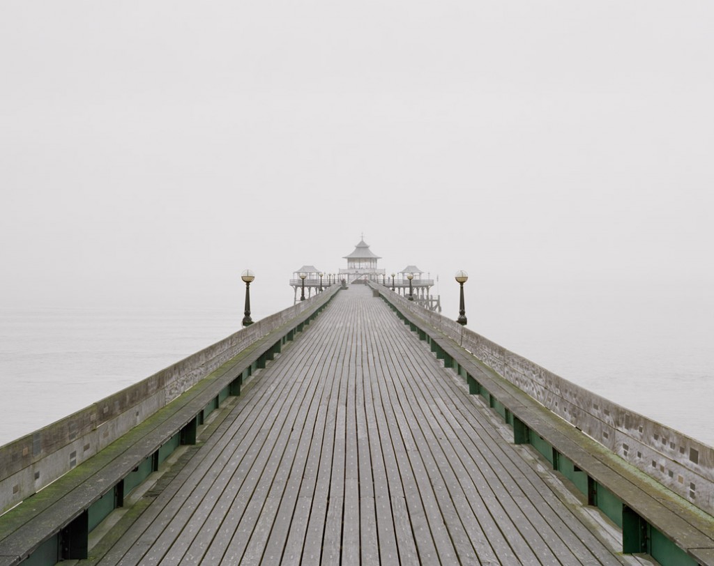
Simon Roberts - The seaside

I do like the work of this photograph and the reason on why I do is because of how it's been shot. It seems as if Robert as used a composition of ''leading lines'' which are lines within an image that leads the eye to another point in the image, or sometimes, out of the image and that's what Robert has done. Also, another reason would be with how white the colour tone is and by it being like this, I personally think it gives off a 'foggy', 'mysterious' effect with how cloudy it is just slightly above the water.
I think they photographed in this specific location because Robert had photographed other piers all around Britain.
The words that I would associate with this picture is 'cold' and 'deserted'. This is because this image has that white-tone to it which gives it that feeling that's it's 'cold' and for 'deserted', no one is around.
A practical considerations that I would of thought the photographer would have to do when shooting this specific photo would be knowing when the weather is going to be bad or good so it'll make his shoot a whole lot easier. Plus, getting the time of day into considerations would be ideal as you would want capture this kind of atmosphere at it's best.

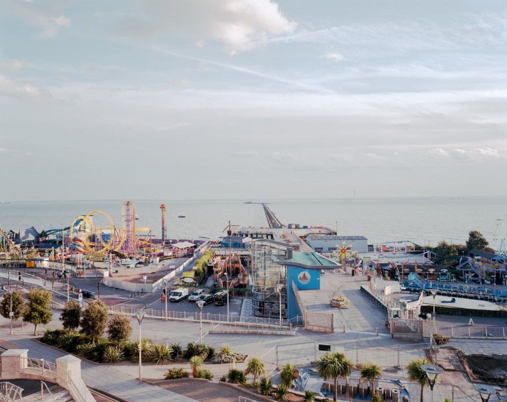
I do like the work of this photograph and the reason on why I do is because of how he's not only captured just the 'pier' but also everything around it which includes a theme park, etc.
The words that I would associate with this picture is 'enjoyment' and 'fun'. This is purely because of theme park which I would associate them specific words for.
A practical considerations that I would of thought the photographer would have to do before taking this shoot is taking the time of the day into consideration to give it that greater look.
Nigel Shafran - Offices
I don't like this photograph and the reason on why I don't is purely because I don't it interesting in the slightness as it just comes across boring and dull.
I think they photographed in this specific location because Shafran wanted to capture his Dad's office in it's exact 'ways' without moving or changing anything around which makes it 'real' and not positioned in a certain way which you would think an 'office' would be like.
The words that I would associate with this picture is 'messy' and 'undercoated'. This is because this picture shows how untidy everything is and for the 'undercoated' then it's just 'dull' and 'boring' with the plain, simple walls.
Richard Billingham - The Home
I do like this photograph and the reason on why I do it comes across quite 'amusing' with the cat flying across the living room.
I think they photographed in this specific location because Billingham wanted to capture what is what like with living with his Dad.
The words that I would associate with this picture is 'amusing' and 'realistic'. I associate 'realistic' with this image because that's how Billingham's Dad actually behaved and that's the reason on why Billingham decided to capture what it was like with his Dad.
A practical considerations that I would of thought the photographer would have to do before doing this shoot is absolutely nothing as you can't wait for something if it's 'realistic', you just capture it when whenever because it's not going nowhere.
I do like this photograph and the reason why I do is purely because it's 'real'. It shows on what Billingham had to cope with his Dad's drunken-self but also, it shows that he was interested in photographing this kind of 'realistic' photography.
The words that I would associate with this picture is 'sad' as it's it a nice thing to see someone in a drunken state, especially if someone who's family.
A practical considerations that I would of thought the photographer would have to do before doing this shoot is absolutely nothing as you can't wait for something if it's 'realistic', you just capture it when whenever because it's not going nowhere.
Jem Southam - Rivers and the Coast
I do like this photograph and the reason on why I do is because it has a strong leading line which draws your eyes further down the photograph which I think makes this image so much stronger.
The words that I would associate with this picture is 'tranquil' as it gives off a peaceful, calm serene.
A practical considerations that I would of thought the photographer would have to do before doing this shoot is would be figuring out what light tone you would like. For example, taking the time of day into consideration would be one.
I do like this photograph and the reason on why I do is because of the reflection in the water. Also with the time of day that it has be taken.
The words that I would associate with this picture is 'dismal' as the picture gives off a 'gloomy' effect.
A practical considerations that I would of thought the photographer would have to do before doing this shoot is the positioning of the camera as you'll need the right angle to get the correct reflection.
Thomas Struth - The forest
I don't this photograph and the reason on why I don't is because I just find it boring as there nothing there apart from trees, brushes and moss.
The words that I would associate with this picture is 'nature'.
A practical considerations that I would of thought the photographer would have to do before doing this shoot is taking the time of day into consideration seeing how you'll need the right light to capture this kind of lighting.
I don't like this photograph and the reason on why I don't is because I don't find it interesting with all the trees, brushes and moss.
The words that I would associate with this picture is 'nature'.
A practical considerations that I would of thought the photographer would have to do before doing this shoot is taking the time of day into consideration seeing how you'll need the right light to capture this kind of lighting.